Showing posts with label Geoff Howell. Show all posts
Showing posts with label Geoff Howell. Show all posts
Thursday, March 13, 2014
Hugo Boss: Organic Nature
Here's a sneak peak at the latest clubroom at the Hugo Boss headquarters
in Manhattan that we produced and installed. In collaboration with
Boss' Visual Director and Jason Wu, Geoff helped design a minimal and
crisp monochromatic space using birch trees against black mirror
backdrops, underlit plexi platforms, large angular built-in glass
terrariums that look like they were part of the original design of the
space, with a polished cement floor. The clubroom, according to Hugo
Boss, was in part inspired by Frank Lloyd Wright's idea of "Organic
Nature"; a symbiotic relationship between architecture and the natural
world. It's also the perfect backdrop to highlight the colorful fashions
of Boss' current collaboration with American designer Jason Wu. Photos by Richard Cadan.


Labels:
Frank Lloyd Wright,
Geoff Howell,
Hugo Boss,
Jason Wu,
Organic Nature,
Richard Cadan,
showrooms
Thursday, October 10, 2013
Throwback: Less is More, profiling Skin care products
Elizabeth Arden's corporate headquarters in the 80's were in a building called Park Avenue Plaza. There were three large showcases in their lobby that Geoff designed and installed on a regular basis. Below are a couple examples of a more minimalist approach to showcasing various skin care products.
In the first shot, Geoff lined the background with blank newsprint plainly pinned to the wall. Across this plane of 'plainess', were pinned a repeating pattern of a portrait of Gary Cooper (cut out of Interview Magazines) and a hand written slogan in step with Father's Day.
In this variation of a minimalist stripey theme, Geoff created large painted canvases with tone-on-tone wide horizontal stripes and one bold bright pink stripe behind plaster cast lettering (a display standard of the day) to showcase the product.
Labels:
Elizabeth Arden,
Gary Cooper,
Geoff Howell,
minimalism,
New York City,
Park Avenue Plaza,
Visible difference,
visual merchandising,
window design,
window display
Thursday, October 3, 2013
Throwback: Imperial Fashion
Back when shoulder padded women's blazers were all the rage (i.e. the eighties), Beltrami's fashions were no exception. They had a giant and fancy store on 55th st. and 5th Ave and Geoff did the windows. For that year's 'travel collection' Geoff recreated a slice of China using 2 giant Foo dog statues and his signature hand painted background, in this case a lovely pagoda inspired fantasy in grisaille.
Labels:
Beltrami,
decorative painting,
figurative painting,
Geoff Howell,
hand painting,
New York City,
pagoda,
visual merchandising,
window design,
window display
Thursday, September 26, 2013
Throwback: Have a seat!
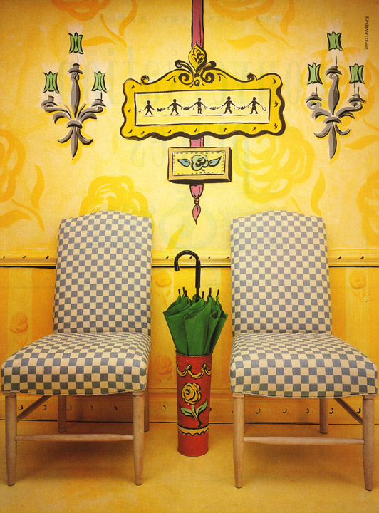
Back in the 80's, Geoff was hired by Life Magazine to create a fantasy set (in this case, a fancy french feeling) to showcase a collection of hand painted chairs. In this "behind-the-scenes" shot, you can see the seamless paper drop incorporated with an actual set piece of a recessed door. There is another seamless paper backdrop behind the door to further a sense of depth. Other than the chairs themselves (and the dog), all the rest is the magic of Geoff's whimsically hand painted designs.
Thursday, August 8, 2013
Throwback: Drawing Rooms
Labels:
advertorial,
decorative painting,
drawing,
Geoff Howell,
home decor,
illustration,
New Yorker Magazine
Wednesday, July 24, 2013
Throwback: Street Flair
Somewhere in the early 90's for a Gay Pride charity event, a parking lot in the west village was turned into a carnival, filled with sponsors and other frivolities. Geoff was asked to create a cohesive and festive visual experience, and each booth was given a three panel painted backdrop. Geoff donated his services to design and paint each backdrop designed to reflect a sponsor or street fair game (like a duck pond). Ready, Set, Paint! (Deliver and Install...)
Labels:
1990s,
charities,
decorative painting,
DIFFA,
figurative painting,
Gay Pride,
Geoff Howell,
Naya,
painting,
perrier,
Sire,
street fair,
The atlantic group
Friday, July 19, 2013
Throwback: Beltrami, Fashion as Art

Labels:
5th Avenue,
Art world,
Beltrami,
Eli Wilner,
frames,
Geoff Howell,
visual merchandising,
window design,
window display
Wednesday, July 10, 2013
Throwback: Your Door
Knock! Knock!
Who's There?
Salvatore Ferragamo!
Another wonderful example of Geoff's work. Geoff was hired by the creative team at Ferragamo back in one Fall, in the late 80's/early 90's to create a series of doors for their Fifth Avenue and 56th St. location. (currently the location of Armani Fifth Avenue). Each door was standard issue hollow core door within a freestanding frame. Geoff hand painted each one to represent a unique entrance. Ferragamo shoes were cleverly displayed on or around the welcome mat. The number 717 on some of the doors reflects the address of the store in which they were shown.
Thursday, June 13, 2013
Throwback: Conversation Pieces
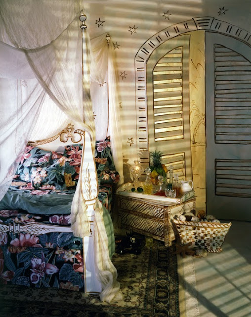
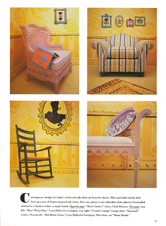
Back in the late 20th century, Brides Magazine was a highly regarded and creative magazine with many special features on home decor and tabletop design. Working closely with the creative director at the time, Geoff was asked to design the layout for this 5 page spread creating painted backdrops, and some of the furniture, in Geoff's own light-hearted and fanciful style.
Labels:
1992,
Brides Magazine,
decorative painting,
editorial,
Geoff Howell,
illustration
Thursday, May 23, 2013
Throwback: Lane Crawford Shoe Catalog
Back in the summer of '02, Geoff was commissioned to art direct and illustrate a catalog of women's shoes for the Hong-Kong based luxury retailer Lane Crawford. Using cut paper, and india ink brushing, Geoff create a unique image backdrop inspired by the shoes themselves. Each image was a full page and the catalog was therefore all double-page spreads. The illustrations were made in pairs that complemented each other and reflect the fabrics, stitching or ornamentation of the shoes or evocative of their purpose, like sandals for a beach. The catalog turned out to be a big success! Literally....as some the of images were later made into billboards!
Labels:
Geoff Howell,
illustration,
Ladies shoes,
Lane Crawford,
print design,
Shoes,
Women's shoes
Subscribe to:
Posts (Atom)


